What They Missed · Part 05/10
It is late afternoon in London, early 2012. Inside the Chief Investment Office of JPMorgan Chase, a spreadsheet is open on a screen. Not a famous spreadsheet — not yet. A workbook among workbooks, one link in a daily chain: numbers are copied out of one file, pasted into a second, carried into a third, until the chain produces a single figure. Value at Risk — the number that tells the bank how much its trading positions could plausibly lose on a bad day.
The number travels upstairs. It is compared against limits. Decisions rest on it: how large the positions may grow, how much room is left, whether anyone should be worried.
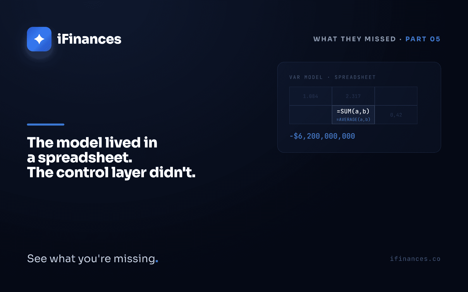
Inside one of those workbooks sits a formula. It takes the difference between two rates and divides. It was meant to divide by the average of the rates. It divides by their sum. The output is a volatility figure roughly half of what it should be, and that figure feeds a risk number calmer than the truth.
The spreadsheet does not object. It cannot. It computes exactly what it was asked to compute, cell by cell, day after day, without one arithmetic mistake. The copying continues. The pasting continues. The number goes upstairs on schedule, and the number is wrong.
What actually happened
The Chief Investment Office existed to invest the bank's excess deposits. One of its London desks ran the synthetic credit portfolio — a set of credit-derivative positions that had grown large enough that funds on the other side of the trades gave the desk's lead trader a nickname: the London Whale.
In January 2012, the portfolio began breaching the bank's Value-at-Risk limits. At the end of that month, a new VaR model was approved for the desk. It reported roughly half the risk the old model had reported. The breaches stopped — not because the positions shrank, but because the measuring stick changed. The positions kept growing.
Through the spring the losses surfaced, first in press reports, then in earnings calls. In May the bank went back to the old model, and the reported risk figure roughly doubled. By the end of 2012, the trading losses had reached at least $6.2 billion. In September 2013, regulators in the United States and the United Kingdom imposed penalties totaling roughly $920 million.
In January 2013, the bank published its own task force report on what had gone wrong. Its description of how the new risk model actually operated deserves to be read exactly as written:
The model "operated through a series of Excel spreadsheets, which had to be completed manually, by a process of copying and pasting data from one spreadsheet to another."
The same report traced the formula error inside that chain: after subtracting the old rate from the new rate, the spreadsheet divided by their sum instead of their average — an error that, in the report's words, "likely had the effect of muting volatility by a factor of two" and of lowering the reported risk.
None of this was hidden. The bank's own model reviewers had noted, before approval, that the manual spreadsheet process was error-prone and difficult to scale, and had asked for it to be automated. The deadline for automation passed. The copying and pasting continued.
The spreadsheet did what it was told
Read those two findings again, side by side. A model that decides how much risk a bank believes it is carrying, completed by hand, by copy-paste, every day. A formula that divides by a sum where it needed an average. Then notice what is missing from the story: at no point does anything watch the watching. The model measured the portfolio; nothing measured the model.
Here is the part worth defending, because it cannot defend itself: Excel did not fail. Not once. Every cell computed precisely the formula it was given. The division by a sum was executed with the same fidelity a division by an average would have received. A spreadsheet is an instrument — it answers exactly the question it is asked, every time, at any scale. The formula was written by a person. The copy-paste chain was designed by people. The decision to run a bank's risk measurement through that chain, and to place nothing above it, was an organizational choice. Blaming the spreadsheet for the London Whale is blaming the calculator for the equation typed into it.
What was absent was a layer with one job: noticing when a number stops making sense. Because the signals were there. A risk figure that halves overnight when a model changes is not a routine update; it is a discrepancy between two measurements of the same portfolio, and a discrepancy is information. In reconciliation terms, two sources disagreed about the same reality — and nobody treated the gap as a question that had to be answered before anything else happened. A number that suddenly improves deserves the same scrutiny as a number that suddenly deteriorates; a deviation is not an error but a signal.
The model lived in a spreadsheet, and the spreadsheet did what it was told. The loss came from the layer that did not exist — the one whose job was to watch what the spreadsheet was told.
What this means for your close
Your close does not run a synthetic credit portfolio. But it runs on the same architecture: numbers that hop between systems and workbooks on their way to a decision. The distance between a bank's VaR chain and a company's month-end close is shorter than the balance sheets suggest. The scale changes; the mechanics do not.
- Map the hops. List the figures in your close that pass through a manual copy-paste before anyone acts on them — the aging total, the FX adjustment, the intercompany balance. Every unwatched hop is a place where a formula can quietly divide by the wrong thing.
- Treat improvement as information. When a number suddenly halves — open items, collection days, a variance that has irritated you for months — resist relief. Investigate a figure that gets better with the same energy you would spend on one that gets worse.
- Let no number validate itself. A figure whose only confirmation is the workbook that produced it is unverified by definition. Cross-check the output against an independent source — the bank statement, the counterparty, the ledger — the way three-way reconciliation puts three versions of reality side by side.
- Keep the spreadsheet; add the layer. The lesson of 2012 is not that Excel must go. It is that Excel must not be alone.
That last point is the inversion worth stating cleanly. The tool was never the problem; the absence of a layer above it was. Your Excel stays — it is fast, expressive, and honest about doing exactly what it is told. What it needs is a mind on top: something that notices when a number stops making sense, and says so before the number goes upstairs.
Where the watching layer stands
The year 2012 appears twice in this series. Part 04 was forty-five minutes without a human gate — automation running with no one empowered to stop it. This part is the mirror image: months of manual work with nothing automated watching over it. The two failures look opposite; they are the same missing layer, approached from opposite sides. Machines without human judgment above them; humans without machine attention above them.
A visibility layer sits in that gap. It reads what your systems already produce — the ledger, the bank, the invoices, the workbook exports — side by side, and it learns what each figure normally looks like. When a number diverges from its own history, or from what an independent source says it should be, the layer surfaces the line and writes the reason next to it: this figure moved this much, this source disagrees, look here. It does not replace the spreadsheet, and it does not decide. It shows, it suggests, it explains — the signature stays human. That is the register iFinances works in, and it is what moving from Excel to financial intelligence means in practice: not abandoning the instrument, but ending its solitude.
Frequently asked questions
Was Excel responsible for the London Whale loss?
No. The bank's own task force report describes a formula written incorrectly by a person, a daily process built on manual copying and pasting, and reviewers whose request for automation went unmet. Excel computed every formula it was given, correctly, throughout. The loss traces to the absence of any layer that independently verified what the spreadsheet was told — not to the spreadsheet itself.
What is Value at Risk, and why did one formula matter so much?
Value at Risk estimates how much a portfolio could plausibly lose on a bad day, within a stated confidence level, and banks set trading limits against it. Because the formula divided by a sum instead of an average, the task force found volatility was likely muted by a factor of two, and the desk's reported risk fell by roughly half. Positions the old model would have flagged kept growing under limits the new number no longer touched.
How can a finance team tell whether its own spreadsheets carry this kind of risk?
Look for three signs: figures that pass through manual copy-paste steps before reaching a decision, outputs that no independent source ever confirms, and numbers whose sudden changes nobody is explicitly tasked to question. The remedy is not removing the spreadsheet — it is adding verification above it, so that every important figure is confirmed by something other than the process that produced it.
It is late afternoon in London again. The chain has run: copied, pasted, computed. On the screen, one cell holds its formula the way it has held it for months — dividing by a sum, meaning an average, saying nothing, because saying is not what spreadsheets do. The workbook closes. The number goes upstairs on schedule.
Everything in that room worked. The paste was clean, the arithmetic exact, the file delivered on time. The only thing missing was the thing that was never built — a layer above the cells, watching what they were told, ready to say: this number has stopped making sense.
Frequently Asked Questions
Was Excel responsible for the London Whale loss?
No. The bank's own task force report describes a formula written incorrectly by a person, a daily process built on manual copying and pasting, and reviewers whose request for automation went unmet. Excel computed every formula it was given, correctly, throughout. The loss traces to the absence of any layer that independently verified what the spreadsheet was told — not to the spreadsheet itself.
What is Value at Risk, and why did one formula matter so much?
Value at Risk estimates how much a portfolio could plausibly lose on a bad day, within a stated confidence level, and banks set trading limits against it. Because the formula divided by a sum instead of an average, the task force found volatility was likely muted by a factor of two, and the desk's reported risk fell by roughly half. Positions the old model would have flagged kept growing under limits the new number no longer touched.
How can a finance team tell whether its own spreadsheets carry this kind of risk?
Look for three signs: figures that pass through manual copy-paste steps before reaching a decision, outputs that no independent source ever confirms, and numbers whose sudden changes nobody is explicitly tasked to question. The remedy is not removing the spreadsheet — it is adding verification above it, so that every important figure is confirmed by something other than the process that produced it.
✦ iFinances — See what you're missing.